

Key Takeaways
Why Scale Is the First Decision to Make
Before considering subject matter or frame color, settle on scale. A small print on a large wall doesn't read as modest — it reads as unfinished. Conversely, an oversized canvas crammed into a narrow hallway can feel oppressive. Getting the proportional relationship right between art and wall is foundational, and it connects directly to the broader principles covered in balance and proportion in interior design.
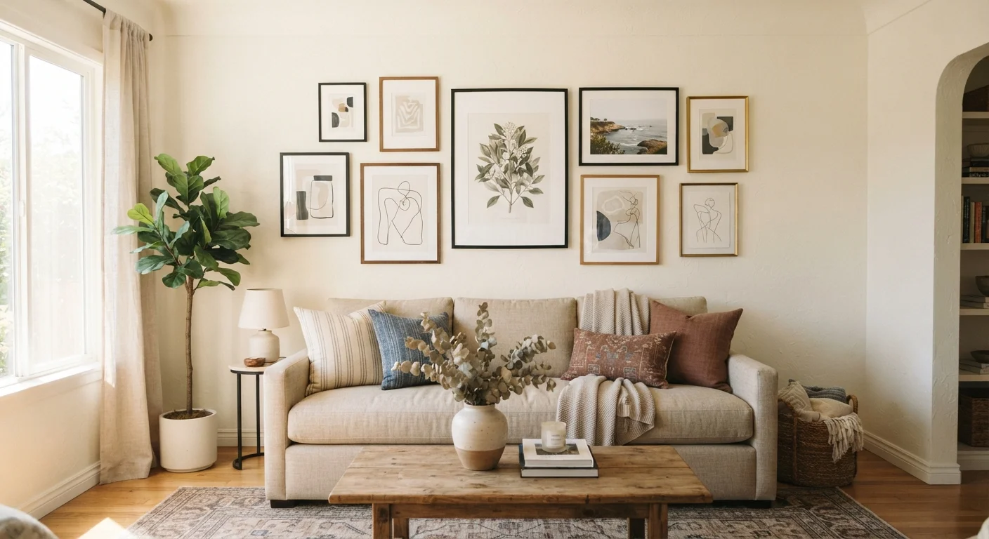
A useful starting point: aim for artwork or a grouping that covers roughly two-thirds to three-quarters of the width of the furniture it hangs above. Above a sofa, that calculation is concrete and easy to measure. For a standalone wall with no anchor furniture beneath it, consider the wall's own width and leave breathing room on either side — at minimum six to eight inches — so the piece doesn't feel crowded against corners or doorframes.
57–60"
Recommended center-hang height from floor
This standard is widely used by gallery curators and interior designers as a baseline for single-piece placement at average adult eye level.
2/3
Art width relative to furniture width below
Interior design guidelines commonly suggest artwork or groupings span at least two-thirds of the width of anchor furniture such as a sofa or console.
Height and Placement: The 57-Inch Rule and When to Break It
Museum curators and interior designers both converge on a widely used guideline: hang the center of a single artwork at 57 to 60 inches from the floor. This places the visual midpoint at average adult eye level and is consistent enough that it works across most standard-ceiling rooms.
Where this guideline bends is above furniture. When a sofa, console, or bed headboard sits directly beneath art, the gap between the top of the furniture and the bottom of the frame matters more than the absolute floor measurement. Aim for six to eight inches of space between the furniture top and the lower edge of the frame — close enough to look intentional, far enough to avoid the piece appearing to rest on the furniture.
Staircase walls are a common exception. Here, follow the angle of the staircase, keeping art centers at a consistent distance from the stairs themselves rather than from the floor, which changes with each step.
Test Before You Hang
Lean framed pieces against the wall at their intended height and live with them for a day before committing to nail holes. Natural light changes throughout the day and can significantly affect how a piece reads — what looks strong in morning light may wash out by afternoon. This brief preview step catches placement problems that are hard to see during the excitement of decorating.
Building a Gallery Wall That Holds Together
A gallery wall succeeds or fails on the strength of its internal logic. Randomly accumulated frames rarely cohere into something that feels designed. The good news: the unifying element can be almost anything — a shared frame color or material, a consistent color palette across the works, a single subject category, or a repeated mat width.
Before committing to a single nail hole, lay the grouping on the floor. Arrange pieces until the overall silhouette feels balanced — this usually means larger, heavier-feeling pieces anchoring lower-center positions, with smaller pieces radiating outward and upward. Trace each frame on paper, cut it out, and tape the templates to the wall with painter's tape to preview the arrangement before hanging.
Spacing between frames is a detail that separates polished results from cluttered ones. Two to three inches between frames is a reliable interval for a tight, cohesive look. Four to six inches reads as more relaxed and airy. Going beyond that risks making the grouping feel like individual pieces that happen to share a wall rather than a deliberate collection.
Always measure the wall and the furniture below it before selecting art size.
Eyeballing scale leads to the most common art-hanging mistake: pieces that are too small for the wall they occupy. Measuring first gives you a target size range before you shop or select from your existing collection.
Use paper templates taped to the wall before hammering a single nail.
Committing to nail holes without previewing placement wastes time and damages walls unnecessarily. Paper templates let you evaluate composition, spacing, and height adjustments at zero cost.
Establish at least one visual thread running through any grouped collection.
Without a unifying element, a gallery wall reads as accumulation rather than curation. A shared frame finish, consistent mat color, or recurring subject matter gives the eye a through-line to follow.
Maintain consistent spacing between frames in a grouping.
Irregular gaps between frames draw the eye to the spaces rather than the art. Consistent intervals — whether tight at two inches or relaxed at five — signal intentionality.
Consider the lighting conditions of the wall before finalizing placement.
A wall that receives direct afternoon sun may cause glare on glass-fronted works or fade certain pigments over time. A poorly lit alcove may render dark-toned art nearly invisible.
Room-by-Room Considerations
The same piece of art can feel entirely different depending on where it lives. In a living room, art competes with furniture, textiles, and lighting for visual weight — it needs enough presence to hold its own. The textiles you choose influence how art reads: a busy patterned rug may call for calmer, simpler artwork overhead.
In bedrooms, art above the bed is a focal point but shouldn't feel heavy or unsettling — lighter subjects and softer palettes generally work better in sleeping spaces. In dining rooms, art placed at seated eye level (roughly 48 inches to center) feels more intimate and appropriate than work hung at standing height. Hallways and entryways benefit from art that rewards close viewing since these are transitional, short-dwell spaces.
For those renting and working around restrictions on nails, reversible decorating approaches — including leaning large frames against walls or using adhesive hanging strips rated for the frame weight — can still yield a curated result without permanent changes.
Curation: The Art of Knowing When to Stop
Curation is a discipline of restraint as much as selection. Every piece added to a wall competes for attention, and at some point additional work dilutes the impact of everything already there. A single strong piece in a room can be more effective than five pieces fighting for dominance.
When editing a collection, ask whether each piece earns its wall space: Does it add something the room doesn't already have — a color note, a texture, an emotional register? Or is it simply filling a gap? An empty wall is not automatically a problem to solve. Negative space is a design tool, not a failure.
Lighting reinforces curation. A picture light or adjustable accent spotlight draws deliberate attention to chosen work and elevates its perceived importance in a room. For a complete approach to this, the guidance in layering ambient, task, and accent lighting applies directly to how art is experienced after dark. Thoughtful curation also means revisiting what's on your walls periodically — rotating pieces keeps a space feeling alive rather than static.
This article provides general decorating guidance for informational purposes. Results will vary based on room dimensions, wall construction, and individual taste. Always follow manufacturer instructions when using hanging hardware, and consult a professional if you are unsure about wall anchoring in rental or older properties.