

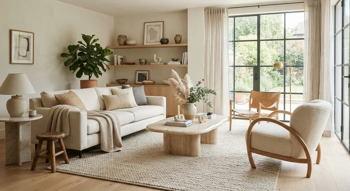
| Terms covered in this glossary | 40 interior design terms |
| Categories covered | Space & scale, color & light, texture & pattern, layout & flow, style & mood |
| Standard main circulation clearance | ~36 inches (General interior design practice guideline) |
| Typical conversation area diameter | Within ~8 feet of seating (General interior design practice guideline) |
| Most common US residential style | Transitional (blends traditional and contemporary) |
Why Design Vocabulary Matters
When you walk into a room that feels effortlessly right — calm, proportioned, alive — there's almost always intentional language behind it. Interior designers use a specific vocabulary to describe what they see, plan, and solve. Learning those terms helps you articulate what you want, understand professional advice, and make deliberate choices rather than guesswork.
This glossary covers 40 of the most practical and commonly used terms, organized so you can return to it as a reference whenever you need it. Whether you're starting a room from scratch or refining a space that's almost there, these definitions will sharpen your eye.
| Terms covered in this glossary | 40 interior design terms |
| Categories covered | Space & scale, color & light, texture & pattern, layout & flow, style & mood |
| Standard main circulation clearance | ~36 inches (General interior design practice guideline) |
| Typical conversation area diameter | Within ~8 feet of seating (General interior design practice guideline) |
| Most common US residential style | Transitional (blends traditional and contemporary) |
Space, Scale, and Structure
These terms describe the physical framework of a room and how objects relate to one another within it.
Proportion
The size relationship between objects within a room, or between an object and the room itself. A sofa that is too small for a large room looks lost; one that is too large feels oppressive.
Scale
The overall size of an object relative to the human body and to the room it occupies. Scale is absolute; proportion is relational.
Negative space
The empty or unoccupied areas in a room or composition. Negative space gives the eye a place to rest and makes featured objects stand out more clearly.
Sightline
The unobstructed line of vision from a given point in a room to another point. Designers control sightlines to direct attention toward focal points and away from less desirable views.
Focal point
The dominant visual anchor of a room — such as a fireplace, large window, or piece of art — that draws the eye immediately upon entering.
Tonal palette
A color scheme that uses different shades, tints, and tones of a single hue to create visual harmony. It achieves cohesion without the flatness of a single-color scheme.
Visual weight
The perceived heaviness of an object as determined by its color, size, density, and texture rather than its actual physical mass.
Layering
Combining multiple textiles, materials, or decorative elements at varied heights and depths to create a sense of richness and dimension in a room.
Vignette
A small, intentionally arranged grouping of objects — typically on a tray, shelf, or table — that functions as a self-contained visual composition.
Biophilic design
An approach to interior design that incorporates natural elements — plants, natural light, organic materials, and views of the outdoors — to strengthen the connection between inhabitants and nature.
Circulation path
The routes people walk through a room during normal use. Good design anticipates these paths and keeps them clear of obstruction.
Cohesion
The quality of a room where all elements feel as though they belong together, achieved through shared color, material, scale, or stylistic cues — not strict uniformity.
Understanding scale and proportion is foundational before any styling decision. If you can read a floor plan, you'll see these concepts expressed in architectural notation as well.
Proportion vs. Scale: A Common Confusion
Scale refers to an object's absolute size relative to a human being — a 10-foot sofa is large-scale no matter where it sits. Proportion is about how that object relates to everything else in the room. A large-scale piece can be perfectly proportioned in a large room and completely wrong in a small one. Keeping both concepts in mind when shopping for or arranging furniture will save considerable frustration.
Color, Light, and Finish
Color and light are inseparable in interior design. These terms help you describe and control how both behave in a space.
- Tonal palette
- A color scheme built from different shades, tints, and tones of a single hue. Creates visual cohesion without monotony.
- Value
- The relative lightness or darkness of a color, independent of its hue. High-contrast rooms mix very light and very dark values; low-contrast rooms stay close to the same value.
- Saturation
- The intensity or purity of a color. A highly saturated red is vivid; a desaturated red reads as dusty rose or terracotta.
- Warm vs. cool undertones
- Colors lean either warm (yellow, red, orange undertones) or cool (blue, green, gray undertones). Mixing undertones without intention often creates visual dissonance.
- Color temperature (light)
- Measured in Kelvins; lower numbers (2700K–3000K) produce warm, amber-toned light suited to living spaces, while higher numbers (4000K+) produce cooler, bluer light suited to task areas.
- Sheen / finish
- The reflectivity of a painted or coated surface. Matte absorbs light; gloss reflects it. Paint finish choices affect both the look and the cleanability of walls.
- Accent color
- A contrasting color introduced in small doses — a pillow, a vase, a single chair — to add interest without overwhelming a neutral scheme.
- Ambient light
- The general, diffused illumination of a room, usually from overhead fixtures or large windows. The base layer of any lighting plan.
- Task light
- Directed illumination designed for a specific activity: reading, cooking, applying makeup. Supplements ambient light rather than replacing it.
- Accent light
- Lighting used to highlight a feature — a piece of art, architectural detail, or plant — rather than to illuminate the room generally.
Texture, Pattern, and Visual Weight
Rooms that rely only on color for interest often feel flat. Texture and pattern add the dimension that makes a space feel layered and alive.
- Visual weight
- The perceived heaviness of an object based on its color, size, texture, and opacity — not its actual mass. A dark velvet sofa carries more visual weight than a light linen one of the same size.
- Layering
- The practice of combining multiple textiles, materials, or objects at different heights and depths to create richness. A layered room avoids the appearance of being furnished all at once.
- Pattern mixing
- Combining two or more distinct patterns in a room. Successful mixing usually varies the scale of patterns and anchors them with a shared color.
- Organic texture
- Irregular, natural-feeling surfaces — woven rattan, rough linen, unfinished wood — that introduce warmth and tactile interest.
- Negative space
- The empty or undecorated areas of a room. Often undervalued, negative space gives the eye a place to rest and makes featured objects read more clearly.
- Vignette
- A small, intentionally curated grouping of objects — typically on a shelf, tray, or tabletop — that functions as a self-contained composition.
- Gallery wall
- A curated arrangement of multiple framed artworks or objects on a single wall. Scale, spacing, and curation are key to making a gallery wall cohesive rather than chaotic.
36"
Minimum clearance for a primary circulation path
A widely used rule of thumb in residential interior design for comfortable walkway width.
3
Objects in an ideal tabletop vignette
Odd-numbered groupings of varying heights are a classic compositional principle in decorative styling.
Layout, Flow, and Functional Terms
These terms describe how a room is organized, how people move through it, and how its parts relate to each other.
- Sightline
- The unobstructed line of vision from one point in a room to another. Designers manage sightlines to control what you notice first when entering a space.
- Circulation path
- The routes people naturally walk through a room. Standard clearance for a main circulation path is roughly 36 inches; secondary paths can be narrower.
- Focal point
- The dominant visual anchor of a room — a fireplace, a large window, a statement piece of art. Every well-designed room has at least one.
- Conversation area
- A seating arrangement scaled and positioned so that occupants can speak comfortably without raising their voices. Typically, seats within about 8 feet of each other.
- Zone / zoning
- Dividing a single open-plan space into distinct functional areas using rugs, lighting, furniture arrangement, or partial walls — without constructing permanent partitions.
- Anchor piece
- The dominant, largest object in a furniture grouping — usually a sofa or bed — around which all other pieces are arranged.
- Area rug sizing
- The practice of selecting a rug large enough to ground a seating group. A common rule: all front legs of the main furniture should rest on the rug.
- Traffic flow
- The pattern of movement through a space over time, shaped by where doors, windows, and furniture are placed.
- Built-in
- Cabinetry, shelving, or furniture that is constructed into the wall rather than freestanding. Built-ins maximize storage and create architectural character.
- Flex space
- A room or area without a fixed single function — a guest room that doubles as a home office, for example. Designing flex spaces requires furniture that can serve multiple roles.
Spatial planning on paper before moving furniture is always worthwhile — the concepts in this glossary translate directly to the symbols and notations you'll find when reading a floor plan.
Style, Mood, and Design Movements
These terms describe aesthetic directions, historical references, and the overall character a room projects.
- Transitional style
- A blend of traditional and contemporary design — neither rigidly classic nor starkly modern. The most widely used residential style in the US.
- Minimalism
- A design philosophy that prioritizes reduction: fewer objects, restrained color, and emphasis on form over decoration.
- Maximalism
- The opposite of minimalism — intentional abundance of pattern, color, texture, and objects. Successful maximalism still follows underlying principles of balance and repetition.
- Organic modernism
- A contemporary approach that pairs modern architecture with natural materials — stone, wood, linen — and curved, biomorphic forms rather than hard-edged geometry.
- Biophilic design
- Design that connects interior spaces to nature through living plants, natural light, natural materials, views of the outdoors, and organic patterns.
- Provenance
- The origin or history of an object. Pieces with provenance — antiques, heirlooms, travel souvenirs — add narrative depth that newly manufactured objects cannot replicate.
- Patina
- The surface quality that develops on materials over time — aged brass, weathered wood, worn leather. Designers often seek out or simulate patina to add warmth and authenticity.
- Curated vs. collected
- A curated room is deliberately edited for coherence; a collected room accumulates meaning over time. The distinction is about intention and editing rather than cost or style.
- Statement piece
- A single object — a bold chair, an oversized pendant light, an unusual rug — that is visually dominant and sets the tone for the rest of a room.
- Cohesion
- The quality of a room where all elements feel as though they belong together, achieved through shared color, material, scale, or stylistic reference — not uniformity.
This article is for general informational and educational purposes. Design decisions depend on individual spaces, budgets, and preferences; consult a qualified interior designer for personalized professional guidance.