

Key Takeaways
Why Decorating Myths Persist — and What They Cost You
Most decorating myths start as shortcuts — rules passed along by well-meaning sources that made partial sense in a particular context but hardened into absolute truths over time. The result? Rooms that feel cautious, flat, or generically safe rather than genuinely comfortable and expressive.
Unlearning these habits is one of the fastest ways to improve a space. The myths below are among the most widespread, and each one is quietly working against the room you actually want. If you're planning a refresh, our room-by-room planning checklist is a useful companion to the corrections that follow.
Myth
Dark colours make a room feel smaller and should be avoided in compact spaces.
Fact
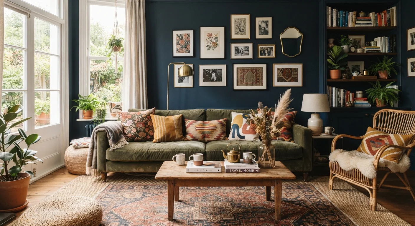
Dark colours can create depth and intimacy — they often make a small room feel more deliberate and cocooning rather than cramped.
This myth conflates brightness with spaciousness. In reality, a deep navy, forest green, or charcoal applied consistently — walls, trim, and ceiling — eliminates the visual interruptions that chop a small room into pieces. The eye reads a single enveloping tone as expansive, not confining. Light colours reflect more light, which is useful in rooms starved of natural illumination, but they are not automatically the right choice for every small space. For a fuller look at how hue and saturation shape perception, see our guide to colour psychology in home décor.
Myth
Everything in a room should match — furniture sets, wood tones, metals, and textiles.
Fact
Cohesion comes from a shared palette or visual logic, not identical finishes. Mixing adds depth; matching too closely produces a flat, catalogue-style result.
Furniture sets sold as a complete package are designed for convenience, not design excellence. Professional decorators typically mix wood tones, layer metals (brass alongside matte black, for example), and pair patterns at different scales. The unifying thread is a consistent colour palette or repeated motif — not sameness of material. A room where every finish matches tends to read as undecided rather than polished. The principle that governs this is visual rhythm, explained in more detail in our overview of balance and proportion.
Myth
In a small room, use a small rug to avoid overwhelming the space.
Fact
An undersized rug is one of the most common decorating mistakes. A rug should be large enough for at least the front legs of all seating to rest on it.
A rug that's too small floats like an island in the middle of the room and actually emphasises how little floor space exists. A correctly sized rug anchors the furniture grouping, defines the zone, and visually expands the perceived footprint. For living rooms, the standard guidance is that all major seating pieces should have at least their front two legs on the rug. For small-space specifics, our small-space decorating strategy guide addresses rug sizing room by room. Textiles in general do far more design work than most people assign them — see how rugs, throws, and curtains function as design tools.
Myth
One good overhead light is all a room needs to be well lit.
Fact
Effective room lighting requires three distinct layers — ambient, task, and accent — working together. A single overhead fixture almost always creates flat, unflattering light.
Overhead lighting illuminates a room uniformly, which sounds helpful but eliminates shadow and dimension entirely. The result is a space that feels clinical or incomplete regardless of how attractive the fixture is. Task lighting (a reading lamp, under-cabinet strip) addresses specific activities; accent lighting (picture lights, uplighters) adds depth and draws attention to architecture or art. Combining all three — and using dimmers where possible — allows a room to shift mood across the day. Our dedicated guide on layering ambient, task, and accent lighting explains exactly how to plan this for any room.
Myth
You need to spend a lot of money to have a well-designed room.
Fact
Good design is primarily about proportion, editing, and intentionality — all of which cost nothing. Expensive pieces in a poorly composed room still look poor.
A room feels designed when the elements within it are chosen with a clear logic and edited ruthlessly. A single quality anchor piece surrounded by thoughtfully chosen secondhand finds consistently outperforms a room filled with expensive items placed without consideration. Editing — removing pieces that compete, crowd, or confuse — is often free and among the highest-impact changes available. This principle sits at the heart of both minimalist and maximalist design philosophies, which approach the question of quantity from opposite ends but both demand intentionality.
Putting the Corrections to Work
Knowing what's false is only the first step. Translating these corrections into real decisions — paint swatches, rug dimensions, lamp placement — takes a little more groundwork.
68%
Homeowners who repaint within 2 years of choosing the wrong colour
According to surveys by home improvement platforms, colour regret is among the most common reasons US homeowners repaint rooms shortly after decorating.
3x
Visual depth increase from layered lighting vs. single overhead
Interior design educators widely cite layered lighting as the single highest-impact change for improving how a finished room photographs and feels in person.
Scale and proportion are the two variables most often ignored when decorators hit a wall. A sofa that's too small for a wall, a rug that floats in the centre of a room, or a single overhead fixture doing all the heavy lifting — these are proportion problems, not style problems. Our guide to balance and proportion in interior design goes deeper on how these principles shape every decision.
Colour choice is similarly misunderstood. Before settling on a palette, it helps to understand what different hues actually do perceptually — not what the myths say they do. The colour psychology guide covers this in practical, room-specific terms. And if spatial arrangement is part of your challenge, see how furniture placement affects perceived room size.
Don't Redecorate Based on Trends Alone
Trend-driven decorating can lead to rooms that feel dated within a few years and require costly updates. Use trends as accent inspiration — a cushion, a vase — rather than as the foundation of a scheme. A well-proportioned, personally edited room will outlast any trend cycle. If you're starting fresh, our guide to decorating from scratch helps anchor decisions in durable principles rather than the moment's aesthetic.