

Key Takeaways
Colour Psychology in Home Décor
Colour psychology is the study of how colours influence human mood, perception, and behaviour. In home décor, it means deliberately choosing paint, textiles, and accents to create specific emotional atmospheres — calm, energised, focused, or welcoming — in each room. Different hues trigger different psychological responses, and understanding those patterns helps homeowners make more intentional design choices.
Colour perception is also shaped by lighting conditions, surface finish, and surrounding colours — so the same hue can produce noticeably different effects depending on context.
Why Colour Is One of the Most Powerful Design Tools
Before choosing furniture or arranging artwork, most experienced decorators start with colour. That's because colour sets the psychological tone of a room before anyone sits down, opens a book, or switches on a lamp. It influences perceived room size, temperature, and energy level — all without moving a single piece of furniture.
Colour psychology offers a structured way to think about these effects. While individual responses to colour vary, certain patterns are consistent enough to inform practical decisions. Understanding the general properties of different hues — and how those properties interact with light, proportion, and material — gives homeowners a real advantage when planning a room. For a broader framework, see our guide on balance and proportion in interior design.
“Colour is a power which directly influences the soul. It is a keyboard, the eyes are the hammers, and the soul is the piano with many strings.”
— Wassily Kandinsky, Painter and influential colour theorist, author of 'Concerning the Spiritual in Art'
The Emotional Signatures of Key Colours
Each colour carries a set of commonly reported associations, though saturation and value (lightness or darkness) significantly affect the outcome:
- Blue: Broadly associated with calm, focus, and stability. Softer blues work well in bedrooms and bathrooms; deeper navy adds sophistication to living rooms and home offices.
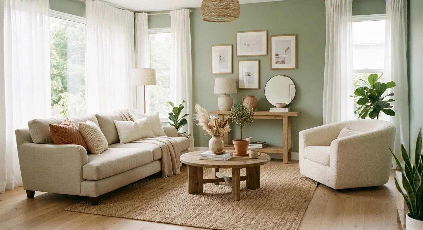
- Green: Linked to nature, balance, and restoration. Sage and olive work in almost any room; deeper forest greens bring warmth and a sense of enclosure.
- Red: Stimulating and appetite-enhancing — research suggests it can raise heart rate and increase alertness. Often used as an accent in dining rooms; generally considered too activating for bedrooms.
- Yellow: Associated with optimism and energy. Works well in kitchens and entryways, but high-saturation yellows can feel fatiguing over large areas.
- Orange: Warm, sociable, and energising. Mid-toned terracottas are more liveable than bright orange for large surfaces.
- Violet and purple: Linked to creativity and luxury. Softer lavenders read as restful; deeper plums feel dramatic and rich.
- Neutrals (white, grey, beige, brown): Flexible and enduring. The undertones within a neutral — warm versus cool — determine how it interacts with other elements in the room.
90%
Of snap judgements about products based on colour alone
A widely cited figure in colour research literature suggests that up to 90% of initial product assessments are based on colour — a finding that translates directly to how people respond to interior spaces.
~5–8 mins
How long before colour affects perceived temperature
Studies in environmental psychology suggest that people in rooms painted in cool blues reported feeling cooler than those in warm-toned rooms, even at the same ambient temperature — an effect that emerges within minutes of exposure.
Matching Colour to Room Function
The most effective approach is to align a colour's psychological properties with the intended purpose of each room:
- Bedrooms
- Prioritise colours that support rest. Soft blues, muted greens, warm taupes, and gentle lavenders are strong candidates. Avoid high-saturation or high-contrast combinations that stimulate the mind.
- Kitchens and dining areas
- Warmer tones — terracotta, warm white, soft yellow, or even a bold accent wall in deep red — support appetite and sociability. These spaces benefit from energising colour more than most.
- Home offices and study spaces
- Muted blues and greens support focus without draining energy. Avoid very dark colours that reduce perceived light, and very bright ones that cause distraction.
- Living rooms
- These multi-purpose spaces benefit from mid-ground colours — warm greens, soft warm greys, and earthy neutrals — that are neither too stimulating nor too subdued.
- Entryways and hallways
- First impressions matter. Warm, welcoming tones or a confident accent colour can set the character of a home from the moment guests arrive.
Test Paint Samples Before You Commit
Paint large swatches — at least A3 or letter-size — directly on the wall rather than using small chip cards. View the sample at different times of day and under artificial lighting conditions. Colours shift noticeably between morning, midday, and evening light, and a shade that looks perfect in the store may read entirely differently on your specific walls.
Light, Finish, and the Limits of Colour Rules
No colour behaves the same in every room. Natural light direction dramatically shifts how a hue reads: north-facing rooms receive cooler, more diffused light that can make already-cool colours feel stark; south-facing rooms get warmer, more intense light that enriches most palettes. Artificial lighting adds another layer — incandescent and warm LED bulbs amplify warm tones, while cool daylight bulbs can make warm colours look flat.
Paint finish matters too. A matte finish absorbs light and makes colour appear slightly darker; a satin or eggshell finish adds luminosity. See our guide to interior paint finishes for a full breakdown of how sheen level affects appearance and durability.
It's also worth noting that colour psychology has real limits. Personal associations — formed through memory, culture, and lived experience — can override general patterns entirely. Someone who associates yellow with discomfort, for example, won't find it cheerful regardless of what studies suggest. This is why testing paint samples on the actual wall, in actual lighting conditions, and living with them for a few days remains the most reliable method before committing. When starting a room plan from scratch, our guide on where to begin decorating a room walks through the full decision sequence, including colour palette selection.